

DeFont
Type: Educational tool for iOS
Contribution: Project Management, User Research, UX/UI Design
Timeline: Feb - May 2017
Team: Zhenyu Ye, Nuomeng Zhang
Design Summary
DeFont is an iOS App of showing and learning Chinese typeface. As my Graduation Design Work, it has been collected in 2017 Excellent Graduation Works Exhibition of CUC.
Now, you can download this App on App Store.
This app is also on the list of ”New apps we love” in September in App Store.

Product Statement
FOR
WHO
THE
IS AN
UNLIKE
Design Beginner, Typography Lovers
are interested in Chinese typography and Chinese Culture
DeFont
iOS Educational App
the traditional way of reading Chinese typography books
OUR PROJECT
shows basic knowledge of Chinese typography and provides an enjoyable experience with microinteractions for the user to feel the beauty of Chinese typography.
Competitive Analysis

I read and analyzed over 10 popular Chinese typeface design books and articles. I found that there is not one clarity of Chinese typeface standard. I illustrate “ Stroke” as an example, every book has its own way to demonstrate the basic knowledge of Chinese typeface, and has its own emphasis. For the beginners, they have to read many books to learn the “basic knowledge”, which would make them confused.
Interviews&Journey Map
We interviewed 10 font designers and 40 font design beginners to understand their feelings and experience of learning Chinese typeface design. After that, I draw a user journey map to visualize the traditional process of learning Chinese Font that amateur designers do nowadays. It is an effective way to figure out our users' pain points.

Insights

From the researches, the traditional way of learning Chinese font design leads to a very steep learning curve. The complexity would make beginners confused. Our product is aiming to provide a lightweight class tool for Chinese typeface beginners before they do a more complicated and professional font design. For the beginners, they need a clear flow and comprehensive knowledge to learned the fundamental of Chinese typeface. After using our App, we hope users can further comprehend the process and features of Chinese typeface design and have the ability to design a simple Chinese font independently.
Define Process
Background Analysis
· The structures, strokes and the layouts of “Chinese Typeface” are totally different from ”Western Typeface”.Pictographic, radicals, and pictograph are unique marks of Chinese characters. During the designing process, we can find it complex to figure out the layouts, structures, and the stroke weights.
· Compared to Japan, which is developed in font design, Chinese font design has an uncertain prospect. As few people place priority on Chinese fonts copyright, Chinese font companies and designers are facing a big challenge to keep their running. More and more pioneers are quitting the font industry.
· To build a strong brand, the font companies refuse to share learning resources. Therefore, there is not one clarity of Chinese font standard like “Western Typeface” for designers to learn today. All the facts make it difficult for the beginners to get a system learning of Chinese typeface.
Interviews&Lectures

Iterative Design
We drafted out the chosen design idea and created a prototype, which was supposed to show a flow of the main functions of our app. We did think-aloud with potential users, gathered usability feedback from them. Then we published our product on the Graduation Design Display to gather more feedback and iterated 3 rounds of the prototype. This process helped us evaluate our final draft of UI.

DESIGN PROCESS
In the process of designing features of our App, I spent over 1 month in interviewing font designers and participating Chinese Fonts Companies lectures to have a deeper understanding of Chinese Typeface Design.
From the interviews and lectures, I learned about the different processes that Chinese font companies design a Font, especially the difference between mainland designers and Taiwan, Hongkong designers. I also interviewed font designers from Japan to learn their design systems. The details and skills of Chinese font design that I learned from these professional designers guide me to design the features of our App.
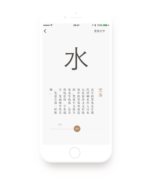
01.HISTORY
The first step of learning Chinese font is to know its history. Since the carved characters originated in Shang Dynasty, Chinese characters have had an almost-4000-years history, with transformations among chirographies and fonts.
Users can browse the evolution of the characters “水”,”甲” ,“楷” to understand different characteristics of historically important typefaces.
The next step of is learning the classify of Chinese type. Like “serif”and”sans-serif” of “Western Typeface”, Chinese font has five basic typestyles.
We provide four different typical characters to show different typestyles.
”永” is for showing the”8 basic strokes”;
”十” is for showing the”hight and width”;
”今” is for showing the”the first and final stroke”;
”国” is for showing the”strokes and around space”;
02.TYPE STYLES
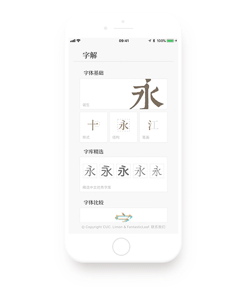
03.TYPEFACE ANATOMY
“Structure”,”Space” and”Link” is the most important part of designing a typeface. Unlike only 26 letters combinations in “Western Typeface”, Chinese typeface has more complicated structures combined with “radicals” and “strokes”.
We choose 4 typical structures of the Chinese character to demonstrate the “Typeface Anatomy” of Chinese typeface.
”永” is for showing the”8 basic strokes” and”single structure”;
”和” is for showing the”left-right structure”;
”惠” is for showing the”up-down structure”;
”风” is for showing the”strokes and round space”.

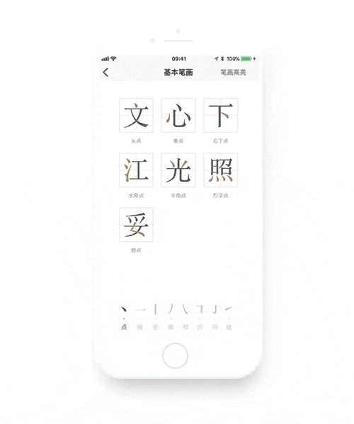
04.STROKE
After learning the basic structure knowledge of Chinese typeface, users can browse all kind of “Chinese Strokes” to learn more details.
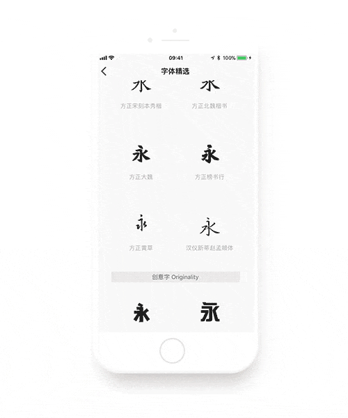
05.TOP FONT
We select 34 famous and typical Chinese fonts recommended by professional font designers and classify them into different typestyles.
This feature helps users feel what is a good typeface and how to use it.
06.COMPARE
The last step is feeling the different fonts in details.
Users can compare two similar fonts by overlaying on top of each other. For example, by comparing “Ping Fang ” and “Hiragino Sans GB” we hope beginner can distinguish details of these two “SimHei” type style.


FINAL THOUGHTS
This project gave me the opportunity to use interactive design to work out a graphic design problem.
Since DeFone showed on the list of ”New apps we love” in App Store, our product has been reported by a lot of tech news websites. We feel our solution did help many design beginners. I’m grateful not only to have been able to work with a topic that I am passionate about but also the opportunity to promote Chinese fonts design industry.